Martin Hall
UIUX Designer

Home View Projects

Date: Aug 2023 - Present

Zero

Zero: Sustainable Money App

Zero is a climate-first fintech offering free personal accounts and a debit card made from 95% recycled plastic. Its GreenScore® tool tracks your spending to help cut your carbon footprint. Unlike traditional banks, Zero avoids investing in harmful industries and gives 20% of its value back to users through a share scheme. Available on iOS and Android.

Brand

Zero

Duration

1 year, 8 months

Role

UI/UX Designer

Location

Wales, Cardiff

Sector

Finance

The challenge

Joining a fintech startup with no prior experience in the sector, I faced the challenge of rapidly understanding a complex, regulated industry while designing user journeys that could compete with leading apps like Revolut, Monzo, and Starling.

As the sole designer, I was responsible for building and managing the entire design system from scratch — every UI component, interaction, and flow had to be carefully crafted to deliver a seamless and trustworthy experience, all while establishing a design standard that could scale with the product.


Toolkit

Below is a list of the tools and technologies I used to complete this project. Selected to support the design process, streamline development, and ensure a high-quality final outcome.


Figma


Flutter


Photoshop


Illustrator


Sharepoint


Miro

Key areas of focus

Joining a fintech startup with no prior experience in the sector, I faced the challenge of rapidly understanding a complex, regulated industry while designing user journeys that could compete with leading apps like Revolut, Monzo, and Starling.

As the sole designer, I was responsible for building and managing the entire design system from scratch — every UI component, interaction, and flow had to be carefully crafted to deliver a seamless and trustworthy experience, all while establishing a design standard that could scale with the product.


Research

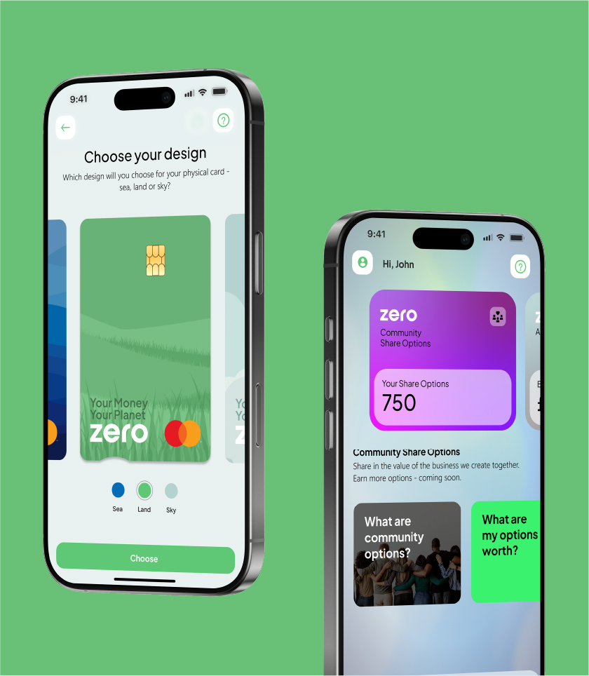
Understanding the customer needs and competitive landscape is essential. Designing without this foundational insight risks misalignment, wasted time, and missed opportunities. As the sole designer at Zero, I worked closely with the product manager through multiple meetings and ongoing conversations.

She provided extensive documentation covering finance, Mastercard, Apple/Google Pay, and more. I also drew insights from 11:FS, a respected fintech consultancy known for its deep analysis of digital banking trends and customer behaviour, to ensure our decisions were informed and relevant.

Understanding

Fintech

Trends


Synergy

Collaboration is a vital part of my design process. As a UI/UX designer, I work closely with cross-functional teams to align on goals, share insights, and ensure consistency throughout the product.

I make it a priority to understand how each team communicates—whether through daily standups, async tools, or detailed specs—and adapt accordingly. Using Microsoft Azure for project tracking and documentation, I ensure all design decisions are clearly recorded so everyone stays informed and momentum is maintained throughout the project.


Wireframing

Wireframing is a crucial part of my design process, it allows me to map out the structure and functionality of a feature before investing time in high-fidelity visuals. By focusing on layout and user flow first, I’m able to identify complexities early, validate ideas quickly, and avoid unnecessary rework later in the process.

At Zero, I regularly held iteration meetings with the product manager to review wireframes, gather feedback, and make fast adjustments. This helped us align on the direction early and ensured smoother handoff to development.


Product design

This stage brings together all previous research, user journeys, and brand insights into a refined, functional product. I follow the Atomic Design methodology to build a scalable design system, ensuring consistency and adaptability across the app.

The process begins with low-fidelity wireframes—hosted on a dedicated canvas used collaboratively with the product owner to validate structure and functionality. Once flows are confirmed, I transition to high-fidelity designs on a separate canvas, serving as the single source of truth for developers. This space houses fully polished journeys, complete with visual design, interactions, and specifications ready for implementation.

Design system

When I joined Zero, the brand already had a basic foundation in place—logo and color palette—which served as a good starting point. I used these existing assets as a reference point and began collaborating closely with the CEO and product owner to better understand the product’s goals and user expectations. These early discussions were critical in shaping the direction of the design system and ensuring it aligned with both the brand and business strategy.

My first step was to define the core style guidelines, including color usage, typography, iconography, and spacing principles. Once the visual language was established, I transitioned into building out the interface components using the Atomic Design methodology. This approach allowed for a modular, scalable system where elements could be reused and iterated on efficiently. The result was a layered, systematic design framework that provided both consistency and flexibility across the product. A visual snapshot of this layered structure is included below for reference.


Style Guidelines
Atomic Design

Color pallette

I extracted Zero's three primary brand colours and developed contrast chips to include in the style guidelines. By creating a range of faded variations for each, I established a more balanced and versatile palette for use in containers and background elements. Additionally, I introduced standard palettes for warnings, errors, and status indicators to ensure consistency across the product.

Custom icons

I created a custom icon sets tailored to Zero’s brand identity, focusing on subtle design choices that reflect the product’s tone and values. Attention to intricacies—such as stroke weight, corner radius, and visual balance—was key to ensuring consistency across the UI. These small but deliberate decisions helped elevate the brand’s personality and made the interface feel cohesive and polished.

Typography system

Zero selected two core typefaces to carry throughout the product: Segoe UI for body text and Plus Jakarta Sans for all labels and headings. Building on this, I developed a structured typography system that defined hierarchy, scale, and usage across all screen types. This font pairing was applied consistently throughout the entire app to maintain visual harmony and enhance readability.

Design kits

As the app was being developed for both iOS and Android, it was essential to adhere to each platform’s native design conventions. To support this, I incorporated official Figma UI kits for both platforms, ensuring I had access to all native components and interaction patterns.

Atoms

The foundation of the design system begins with atoms—the most basic, reusable UI elements. I built out all the core atomic components used consistently across the app, ensuring a single source of truth and visual consistency throughout the interface. These included elements like inputs, buttons, and base screen structures. While this is just a snapshot, the full system contains over 100 unique variations within the atom layer alone.

Molecules

Once the atomic components were in place, I began assembling molecules—groups of atoms that function together as reusable UI blocks. These included navigation menus, notification alerts, nested button groups, and containers used to display financial data like balances and spending. As this is a banking app, it was crucial that these components were not only visually consistent but also context-aware, ensuring users could access key financial information clearly, quickly, and with a sense of trust across all areas of the interface.

Low fidelity design

All user journeys and early concepts were captured within my dedicated ‘Low Fidelity’ board in Figma. Working closely with the Product Manager, she would provide end-to-end journey ideas which I would translate into structured flows. Depending on the complexity of the feature, I would either begin with simple wireframes or build full low-fidelity user journeys to explore layout and functionality.

This board served as a collaborative space exclusively for myself and the Product Manager, acting as an evolving archive of ideas, explorations, and iterations. It allowed us to quickly validate concepts, identify usability issues early, and maintain a clear record of the design evolution.

High fidelity design

All user journeys and early concepts were captured within my dedicated ‘Low Fidelity’ board in Figma. Working closely with the Product Manager, she would provide end-to-end journey ideas which I would translate into structured flows. Depending on the complexity of the feature, I would either begin with simple wireframes or build full low-fidelity user journeys to explore layout and functionality.

This board served as a collaborative space exclusively for myself and the Product Manager, acting as an evolving archive of ideas, explorations, and iterations. It allowed us to quickly validate concepts, identify usability issues early, and maintain a clear record of the design evolution.

Zero:
Sustainable Money App

ZERO is a Cardiff-based fintech startup focused on ethical banking. For two years, I’ve designed low-to-high fidelity prototypes and worked closely with developers to create a seamless, user-friendly experience.

UIUX DESIGNER

Aareon:
Property Management

At Aareon UK, I redesigned and modernized legacy systems for the social housing sector, improving efficiency, reducing costs, and enhancing user experience.

UIUX DESIGNER

Toyota:
Kinto

Subcontracted by Smoke & Mirrors, I designed web pages for Kinto, Toyota’s mobility brand focused on sustainable and flexible transportation, ensuring a seamless user experience and brand consistency.

UI Developer

Currys:
Rebrand

Employed as a UI/UX designer, I worked on Currys' web pages during their rebrand, ensuring designs met strict brand guidelines while improving usability and customer experience.

UI DESIGNER

iCommerce:
Shopify Development

As a UI/UX designer at Integrity Commerce, I designed websites and complex application interfaces for Shopify businesses, creating low-to-high fidelity mockups while ensuring compatibility with Shopify Liquid and Polaris.

UIUX DESIGNER

Welcome! You have unlocked the protected content. 2

Logout